The team behind the updated Media Museum in Hilversum had to deal with a subject matter that’s constantly evolving and a desire for an unconventional design approach. Re-opened to the public last month after five years of planning and two-and-a-half years of renovations, The Media Museum of Sound and Vision in Hilversum in the Netherlands, is an immersive experience exploring modern media. It’s become a museum that continuously adapts to the actions of its visitors in order to reflect the ever-changing face of media culture.
Its location is no accident, Hilversum is often referred to as ‘media city’, as it is the home to a multitude of radio and television broadcasters in the Netherlands. The museum, home to a huge archive of Dutch TV footage taking up five floors below the ground floor (and six above), first opened in 2005, but since then the media landscape has changed dramatically with the introduction of the iPhone and YouTube changing how we consume media. To reflect those changes the process to redesign the entire museum started in 2017 when the client (The Netherlands Institute for Sound & Vision) decided after a long period of brainstorming to update the site. To do this it called upon a range of companies in 2017 to design and install the AV inside.
The initial concept was created by XPEX, while Tinker imagineers was responsible for the spatial and AV design, the lighting design by ACTLD, the different exhibits were built by Bruns, software for the exhibits was created by Kiss the Frog, project management of the AV and lighting was handled by SemMika, AV and lighting hardware was supplied and installed by BeamSystems, Geluidburo were brought on board to offer acoustic consultancy, and the LED modules, LED floors and set lighting installation was completed by Ata Tech.
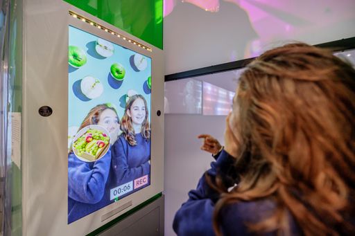
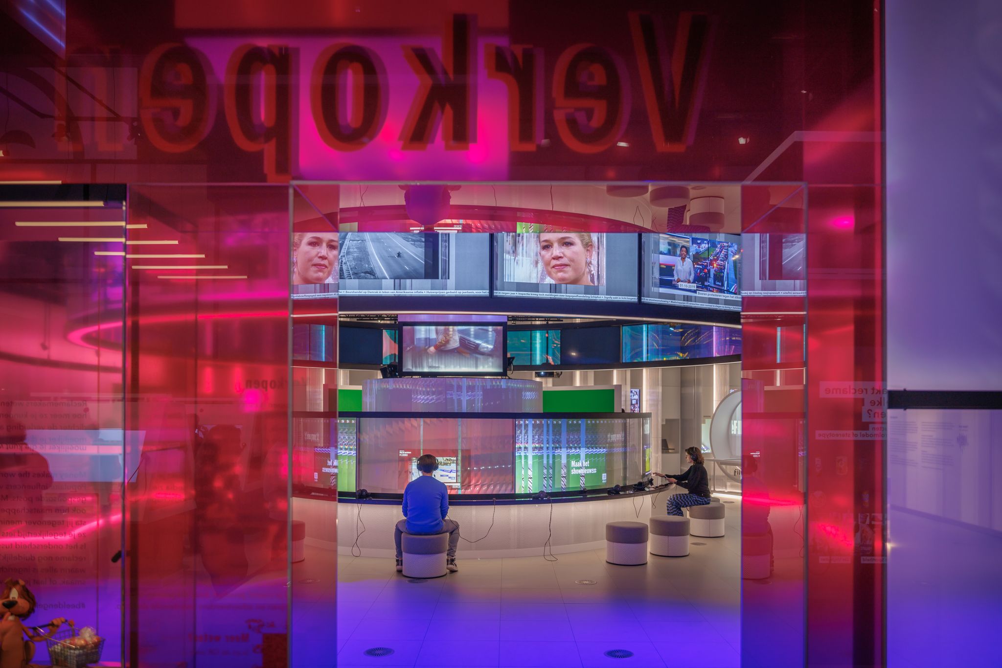
How we consume media is revealed in five zones in the building: Share, Inform, Sell, Tell and Play. The Media Museum includes more than 50 interactives, with hundreds of hours of AV material and objects from history. The experience uses facial recognition and the user’s own smartphone to make it a personalised museum journey for everyone.
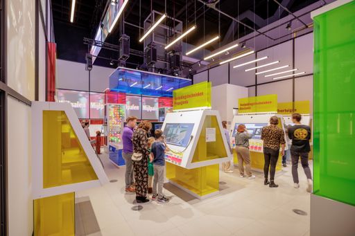
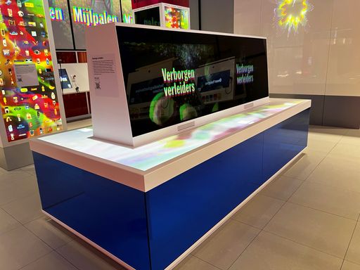
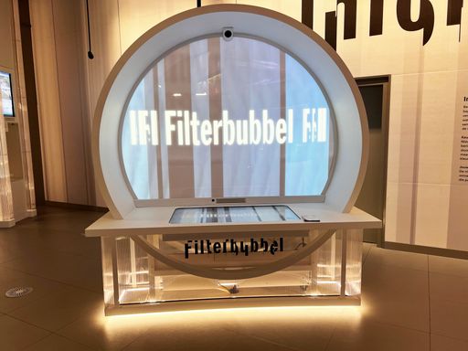
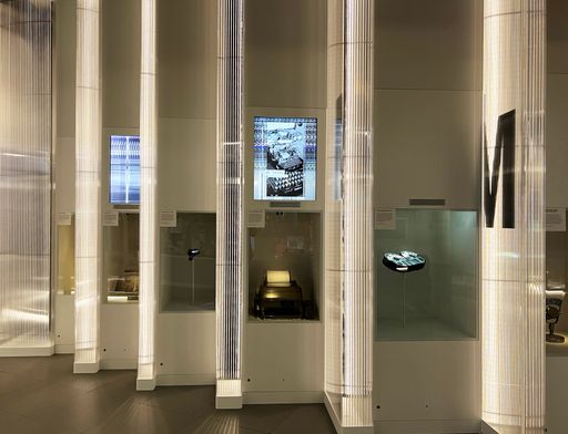
Tinker imagineers, an international experience design agency based in the Netherlands, was one of the first companies back in 2017, and was given the unusual brief by the client, ‘to make a museum about media without screens’. “That gave us a headache, but it was also a challenge,” said Itamar Naamani, senior experience designer at Tinker, who led the design team in this project. “We had to try and avoid anything that looks just like a screen. Of course, we cannot avoid screens altogether, but we did try in the beginning to find ways of creating something that really looked different.” In the beginning of the design phase the initial idea was to create a layered screen design. Tinker, together with SemMika, explored stacking transparent OLED screens behind each other so they could physically separate backgrounds, to resemble a web page where there is a background with images on top of those. During the initial tests Tinker found it didn’t work for a number of reasons; “It was too expensive, too complicated and too limited because we had to use 50- and 55- and 65-in screen sizes, and we wanted to use other formats too,” adds Naamani.
The team then explored working with layered projections, using a holographic projection screen supplier, again with not much success. “We did a lot of testing throughout this project because nothing was ‘off the shelf’. What we decided in the end was to never have a basic screen aspect ratio. It’s never 16:9, it’s always masked off in an unusual way, and everything is integrated very much with the spatial design, it’s never a screen on a pole, it’s always totally integrated into design. It has to blend in with the environment, and with the experience so you will never say oh there’s a screen, and I’m going to touch it.”
What did the client want the AV technology to do in the revamped Media Museum. “They wanted it to be very fluid, in a way that this museum has to adapt itself to each individual visitor,” says Naamani. “They didn’t want a basic sound and vision exhibition, they wanted a more magical way of getting the media out of the air. The media should be surrounding you, over your head, if you do something in an interactive or you make a little recording, you should see that recording going up in the media surrounding you,” said Rutger van Dijk, AV consultant from SemMika.
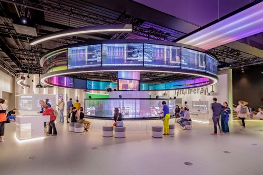
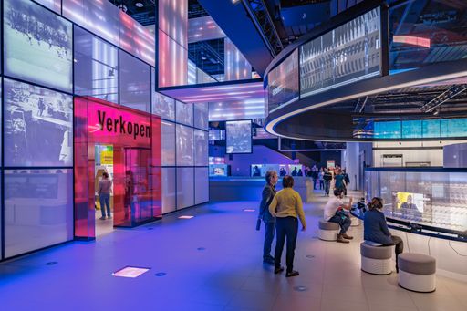
This idea of ‘in the air’ is illustrated immediately for visitors walking into the Media Museum, when they are met by the Media Reactor. Naamani explains its conception: “From the beginning the museum wanted to have an AV artwork, to be a beautiful eyecatcher. It wasn’t part of our assignments in the beginning, but we felt the need during the design to have something that connects all these five different zones with each other into one big gesture.” The Media Reactor is just that, a giant 300-metre LED screen installation that hangs throughout the museum, connecting the different zones and depicting the permanent flow of media. Having the idea is one thing, how did it become a reality? “We created great 3D images of what it would look like, but we didn’t have any clue of how to actually create it within budget. That proved quite challenging, especially with the existing hardware we could use (projection), it would have been possible, but it would have been quite tricky with all the shadow casting and all the different angles that we had to project from,” says Naamani.
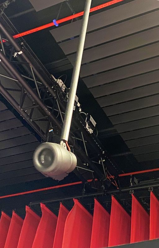
In the end it was solved by creating a bespoke piece of hardware to achieve this effect, which made it possible to create such a large AV installation within budget. The Media Reactor consists not of direct LED as you’d probably expect (and would be far simpler to install), again keeping with the ‘museum with no screens’ directive, it is made up of strips of LEDs, which can all be individually controlled, put into a frame with a fabric placed over it. To continue with the theme of ‘no screens’, images are sometimes superimposed and stretched over different screens to move away from a conventional museum display approach and can be combined with projectors (a mix of Canon and Optoma) hidden in the ceiling also shining content onto the fabric-covered LED screens. Content for the Media Reactor is run in a loop via a Disguise media server, using archive video content interspersed with user-generated content during the day.
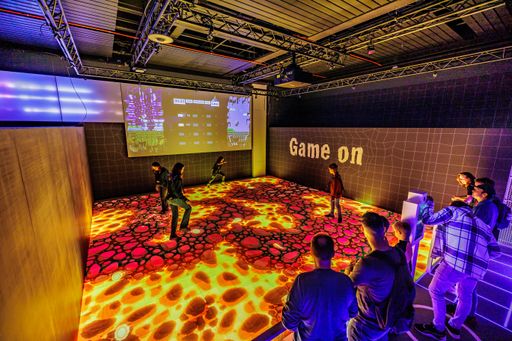
The Media Reactor was built and tested off-site in parts measuring 5x2-metres says Tom Aarts, director, Ata Tech. These were driven to the site on two huge trucks and winched (very carefully) through a hatch in the roof, because they were too big to get through the doors. Other standout technologies at the Media Museum include two interactive game floors in the museum. On the large digital game floor (7.5 x 7.5 metres) in the ‘Play’ zone, visitors can play a life-size video game, and at the game floor in the Tell zone, visitors can meet their own interactive superhero by answering questions. When visitors arrive at the museum they create an account and get their profile picture taken, they are also scanned for facial recognition, so when they walk through the museum they are instantly recognised at each exhibit. “It will even incorporate your age or where you’re from and what your media interests are. It will select different types of content in the exhibits that would kind of match your interests and age,” adds Naamani. To allay any security and privacy concerns around the use of facial recognition, all data is deleted from the system every night.
If you are thinking the use of individual profiles and facial recognition makes this feel like a solitary experience, you’d be wrong. Visitors to the Media Museum can come as a group and connect profiles to friends when they first walk through the door. There are also a number of the 50+ interactives where people can interact with each other. One zone, Share, is specifically about personal sharing through media. One game is called code language where two people sit on either end of a table and have to transmit a message using either emojis only or through any limits of existing technology, ie Twitter and 140 character limit. The other person has to understand what the meaning of the message was. There’s also a round table where random visitors can sit down on the table, and you have to find common interests between the group, which then triggers a quiz on their common interests. “It represents the fact that people find communities on common interests online,” says Naamani.
A majority of the interactives are run using Dell Precision mini-PC/NVIDIA Quadro RTX 3000 with iiyama touchscreen displays. Audio at the museum was reinvented from the ground up. The old museum was a noisy experience, so acoustic treatment was fitted to ceilings and walls before the AV was even installed. Small line array speakers and ceiling speakers from K-array were fitted to provide a narrow beam of audio so people even one metre away at another exhibit don’t experience any noise pollution. Audio processing is handled locally at the exhibits, or via Q-Sys DSPs running Dante networked audio in larger areas.
Being told you have to create a museum ‘without screens’ would strike fear into the hearts of many exhibition designers or AV consultants or system integrators, but here it has fully been embraced as a challenge to overcome. In recognising that the media is an ever-evolving culture, the AV teams behind the Media Museum have had to offer the client the ability for it to be constantly updated, and they have, otherwise it would end up with the same fate as the first iteration, out of date after some years. The wealth of content on display at the Media Museum is astonishing, Tinker said it would take more than 70 hours to watch everything that’s been produced.
Final word goes to Stan Boshouwers, owner of Tinker imagineers: “In this experience you literally step into cyberspace, you enter the online world. We designed it that way because we live in a mediated world these days. If you look at the screen time on your smartphone, your daily screen time starts to approach the time you spend with people in real life. Add to that television and computer screen time, and you can see that we perceive our world largely through intermediate means, in other words media. In contrast to the past, media content is largely created by ourselves. Therefore: the media define us, and we define the media. The museum’s goal is to make the visitors aware of this.”
Read the Inavate's article

